Mikro
Context
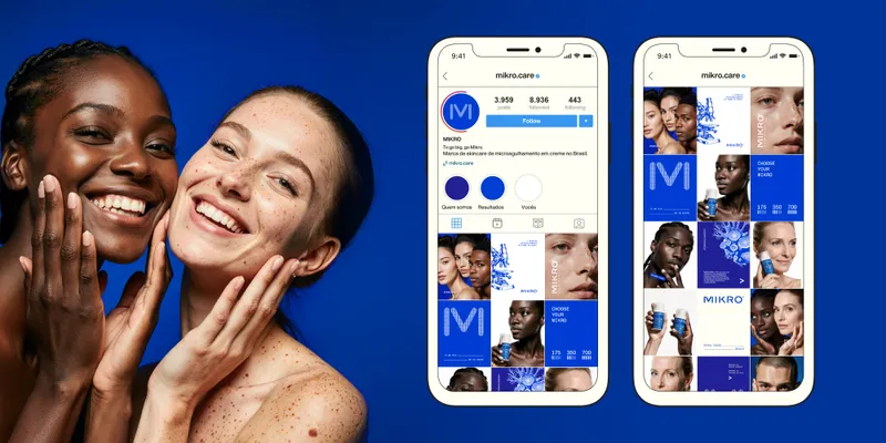
The skincare industry is crowded with brands that look clinical and sterile. Mikro, while rooted in scientific precision, needed a visual identity that felt advanced yet approachable.

Solution
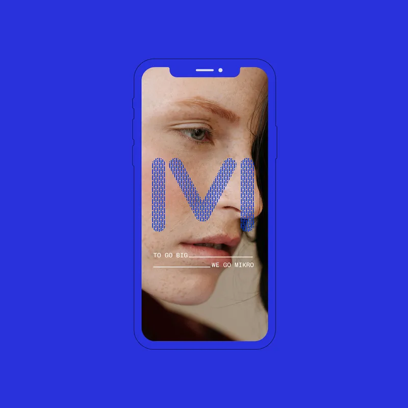
To go big, we went Mikro. The answer lay in the brand’s very essence: the bio-needles. By reimagining them into a proprietary design element, Mikro crafted a logo that is both modern and ownable. The soft, rounded edges defy the rigid, antiseptic look of competitors, making technology feel more human.
This concept extends beyond the logo. The microscopic vision of the brand materializes in a signature texture, embedding the bio-needles into the very fabric of its identity.


Concept
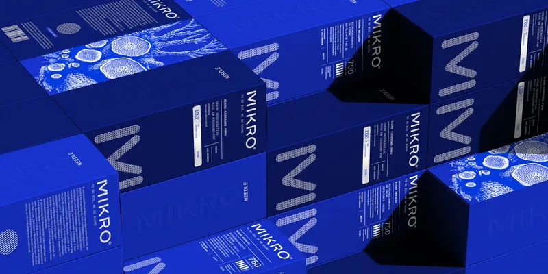
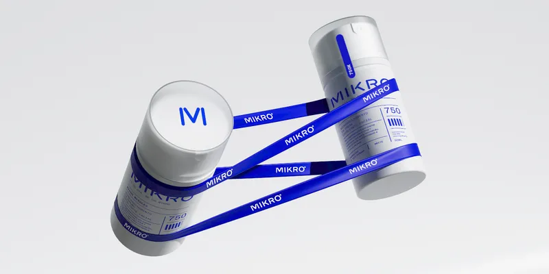
The packaging, inspired by pharmaceutical inserts, reinforces scientific credibility while maintaining a clean, structured, and engaging look. Bold blue hues and a sleek layout amplify the brand’s contemporary, high-tech appeal.