LocationBrazil
RoleBranding & Illustration
Date2021
Conta Futuro


Challenge
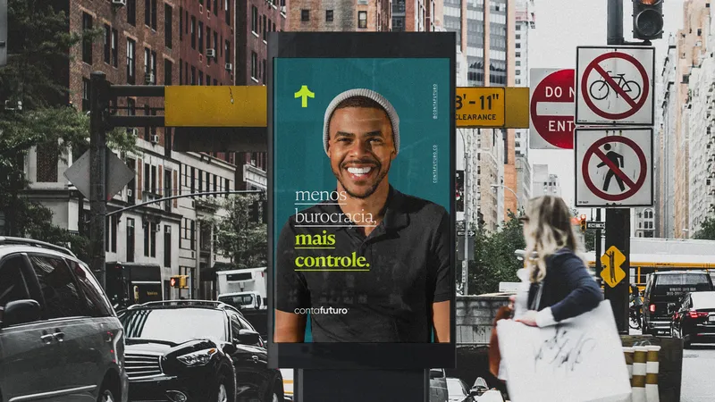
Highlight ContaFuturo's services from the many already present in the market by emphasizing originality, practicality and proximity. The brand needed to balance boldness and simplicity in its visual identity to be able to fully communicate its differentials and bring the public closer.


Solution
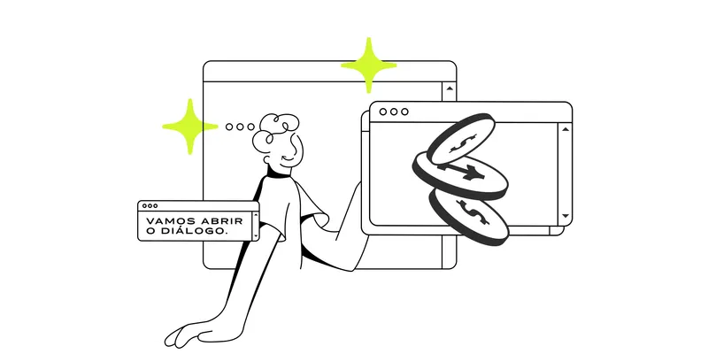
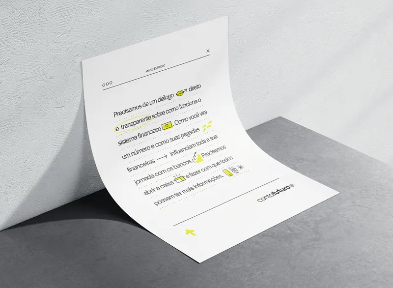
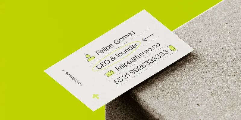
A vibrant combination of colors, typography and illustrations that creates an authentic and friendly visual narrative. The minimalist elements together with a young and bold graphic language carry the impact and dynamism of the brand in an inviting way.

The Symbol


To represent a new direction in the financial market, nothing better than the universal symbol of directions. Pointed upwards, the icon communicates the concepts of growth and progress, while the curved stroke reinforces the friendly side of the brand.

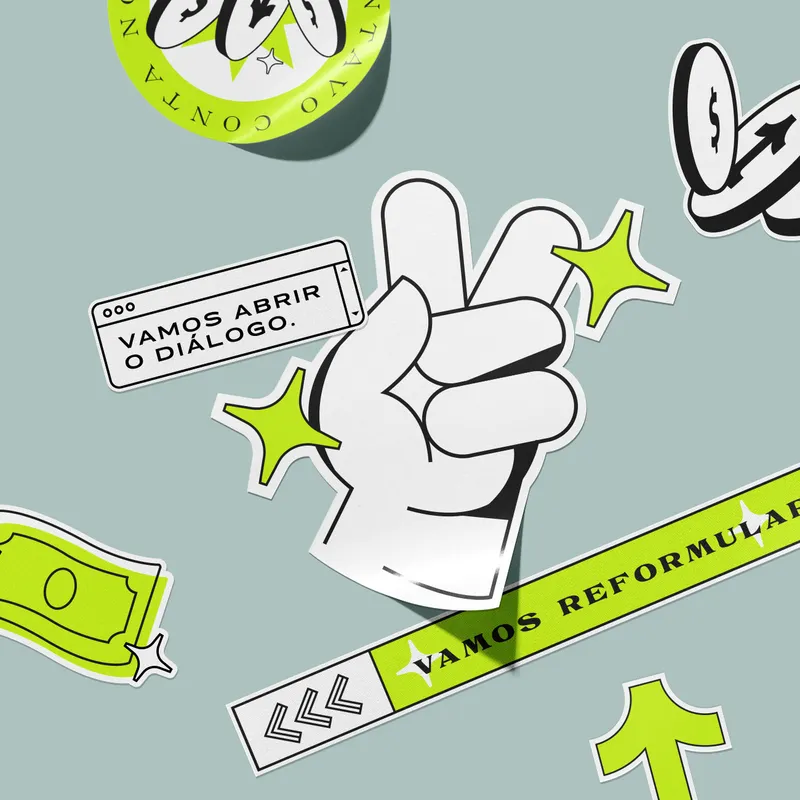


To make it even easier for ContaFuturo to communicate with its customers, we have developed fun and inclusive illustrations.