Bebecê


Challenge
Revamp the brand to embody its core values and resonate with the modern consumer by redesigning the logo and expanding its visual universe.
Solution
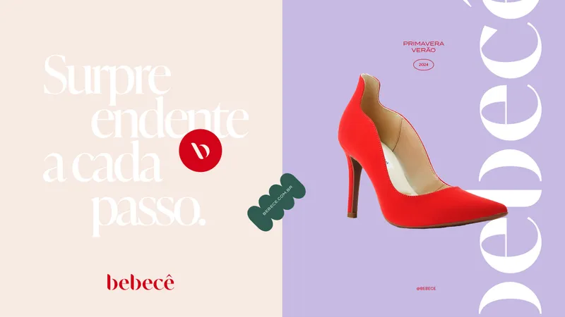
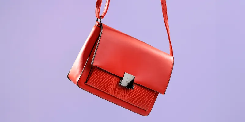
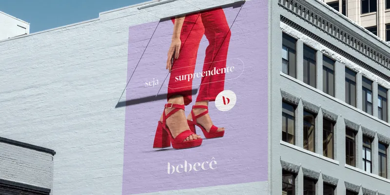
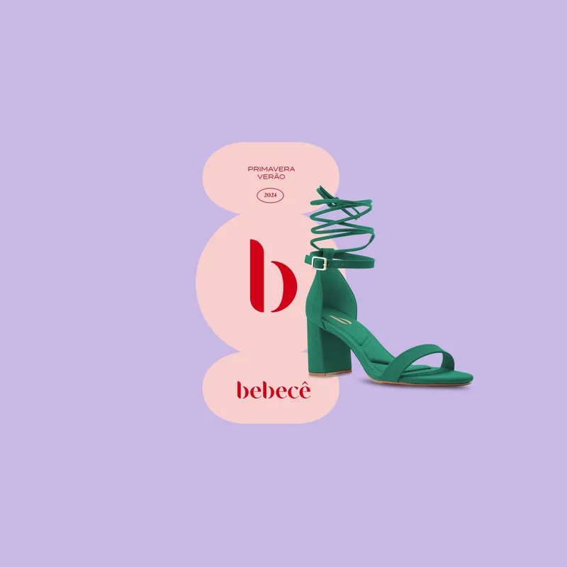
So, for the new visual identity, we embraced interventions and contrasting thicknesses in the logo that make the brand more authentic, proprietary, and connected to the fashion universe. Additionally, the visual assets explore the feeling of comfort with modern, rounded, and synesthetic shapes, while striking color combinations and contemporary applications spice up the cozy atmosphere.
Insights

After analyzing Bebecê and its competitors, we understood that for the success of the rebranding, we needed to consider the following elements in the new identity:
Quick association with fashionRedesign the logo in an authentic and fashion-forward way to enhance the brand's perception of style and its products.

Comfort is coolOne of Bebecê's differentiators is its focus on comfort, which aligns with modern consumers' prioritization of well-being. Therefore, we need to visually revisit the concept of comfort with a more contemporary and appealing approach.
A dynamic brandCreate an identity rich in possibilities to adapt to various campaigns and collections, avoiding the loss of visual coherence often seen in competitor campaigns.
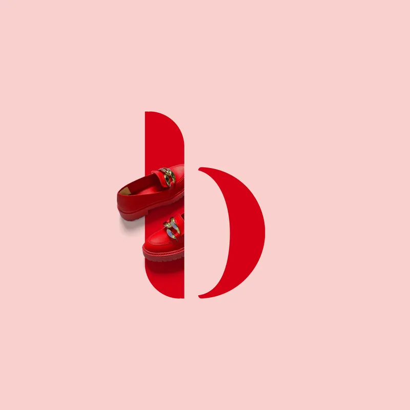
Contemporary and minimalist, the symbol makes its elegant presence felt. It serves as a functional reduction that accompanies the brand across various touchpoints. Also the curved edges and concave part of the B evoke a sense of comfort.

Result: a surprising brand at every step.
bebecê revamp
