Abello Mel
 LAD Awards2024


Challenge
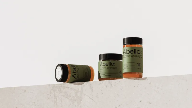
From the name to the visual identity, our brief was to create an innovative brand that emphasizes the well-being benefits in an approachable, modern, and straightforward way.
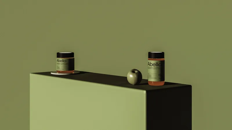
Rebranding the honey.With a strategy to shift the perception of honey into an everyday wellness staple, by adopting cues from the supplement industry that have already made their mark.
Instagrammable honey.From the table to the feed: an aesthetic concept tied to decoration and ornamentation, making the honey suitable for stories and photo dumps.
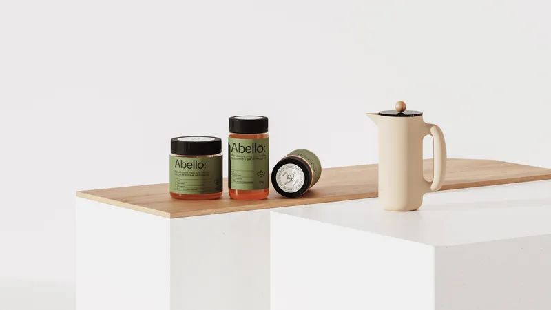
Less is more.Clean compositions that capture attention precisely because they diverge from the heavy and loud visuals of competitors that often blend together.

Solution
A minimalist and powerful brand that redefines honey, an age-old food, for contemporary consumption. Through a new narrative that aligns honey with beloved products sought for performance, nutrition, and supplementation, and further, with a disruptive language.
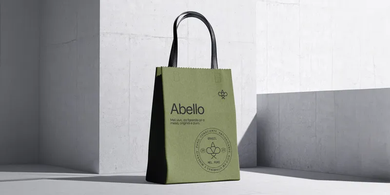
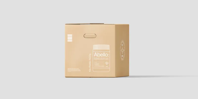
A proprietary symbol derived from the logo itself, connecting the brand to the world of apiculture while maintaining the contemporary approach.
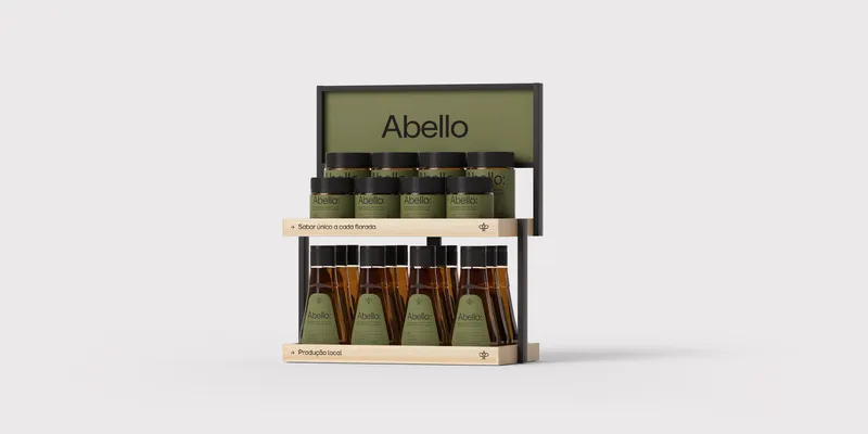
To set Abello apart from competitors and link it with well-being, the brand's main color is the contemporary Matte Green. In concert with the delicious caramel and warm earthy tones, a well-balanced, functional, and captivating color palette is formed.
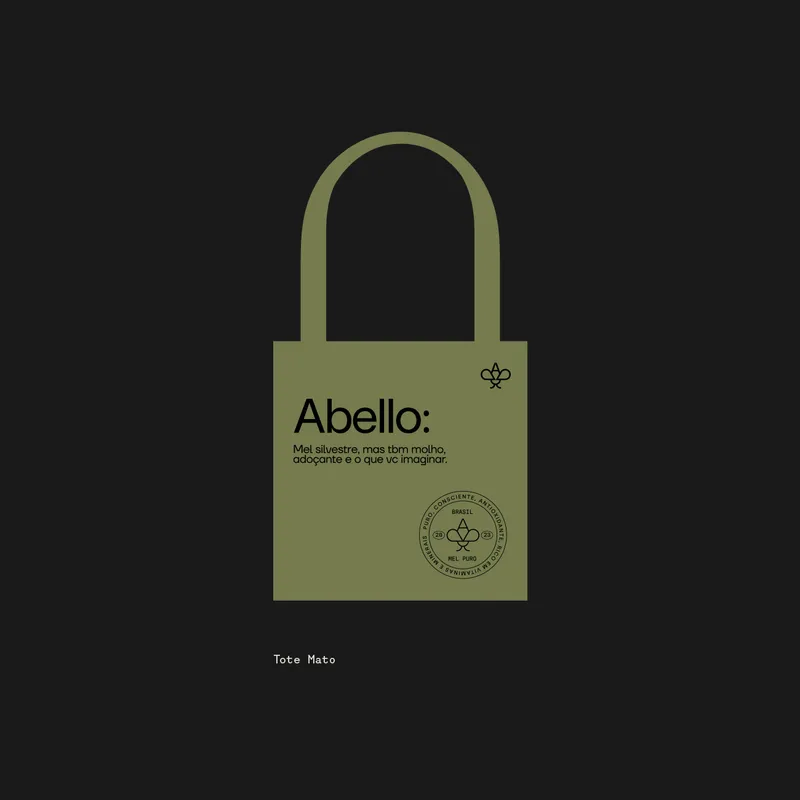
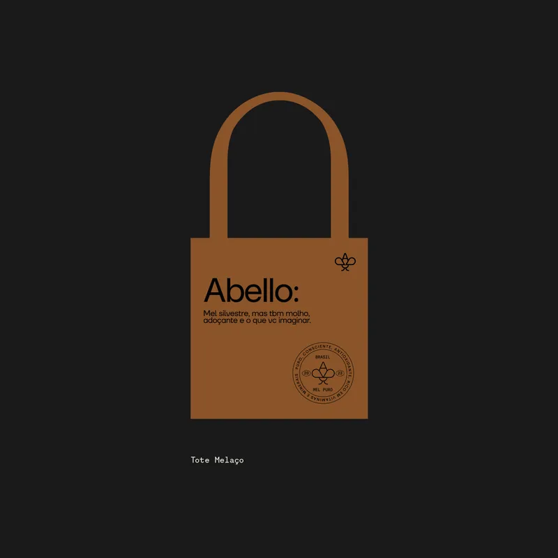

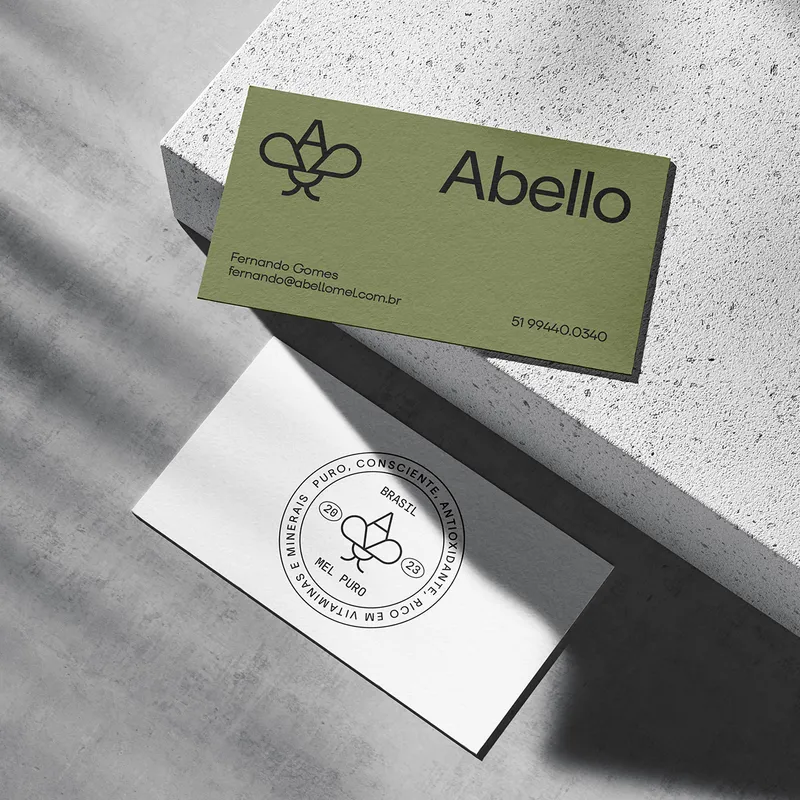
Without serifs and adornments, our creation was a straightforward logo for a honey that speaks its mind.