TERRATALO GUIDELINES
VERSION 1.0 SEP/2023
TerraTalo Guidelines
Hey there, this is the default text for a new paragraph. Feel free to edit this paragraph by clicking on the yellow edit icon. After you are done just click on the yellow checkmark button on the top right. Have Fun!
Hey there, this is the default text for a new paragraph. Feel free to edit this paragraph by clicking on the yellow edit icon. After you are done just click on the yellow checkmark button on the top right. Have Fun!
1.1 Logo
1.2 Symbol
1.3 Reduction
1.4 Clear Space
1.4 Positive/Negative
1.5 Color Palette
1.6 Typography
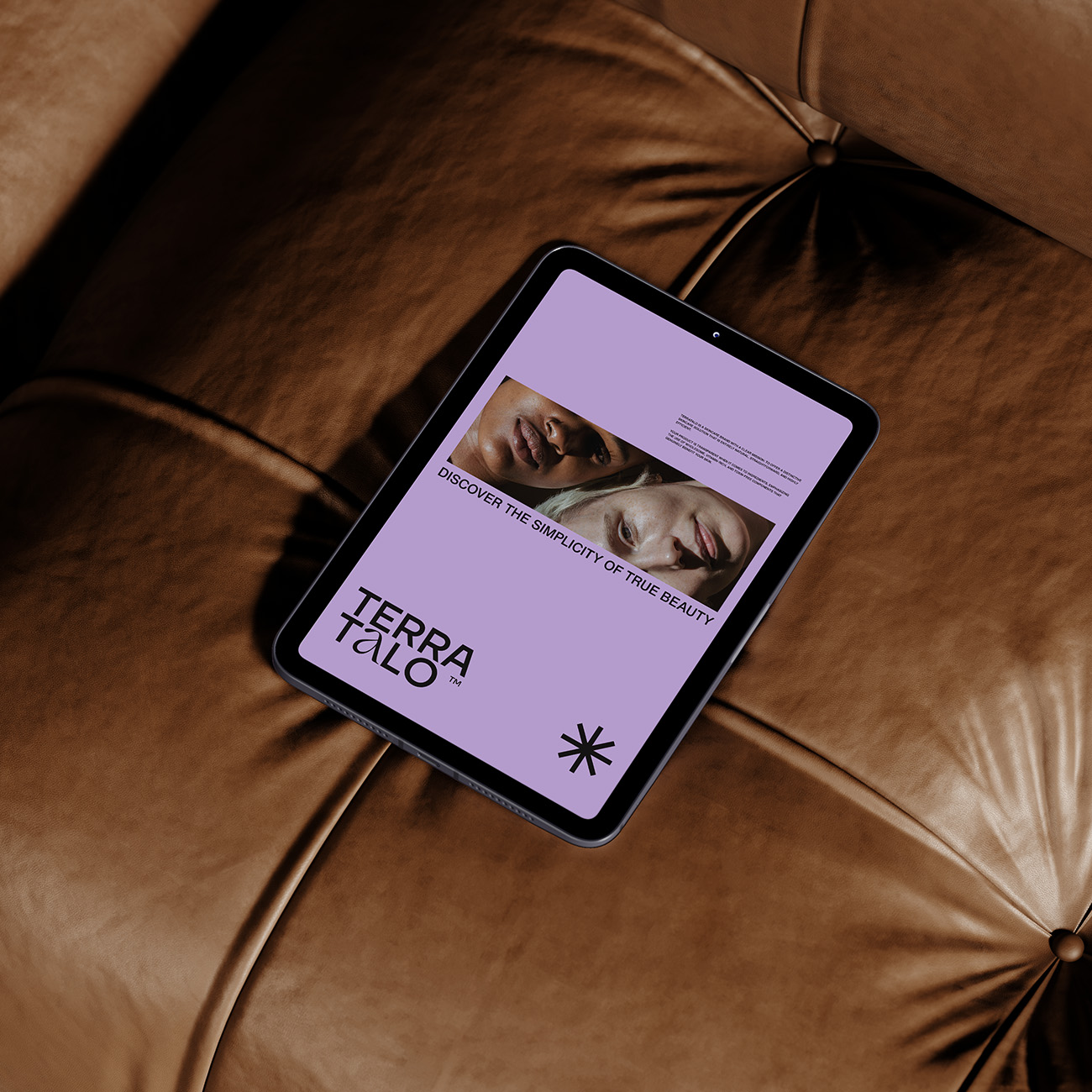
1.7 Liveview
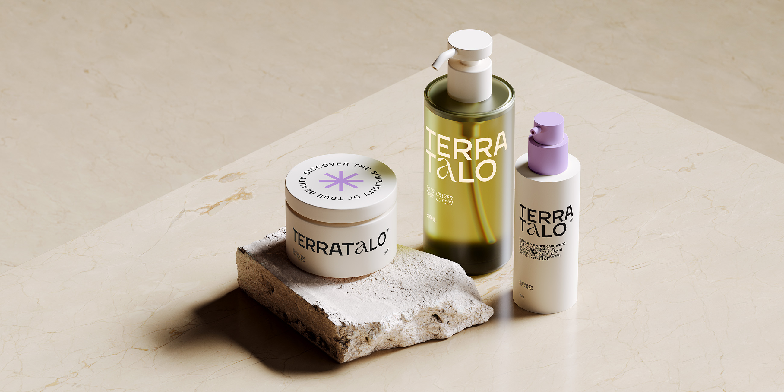
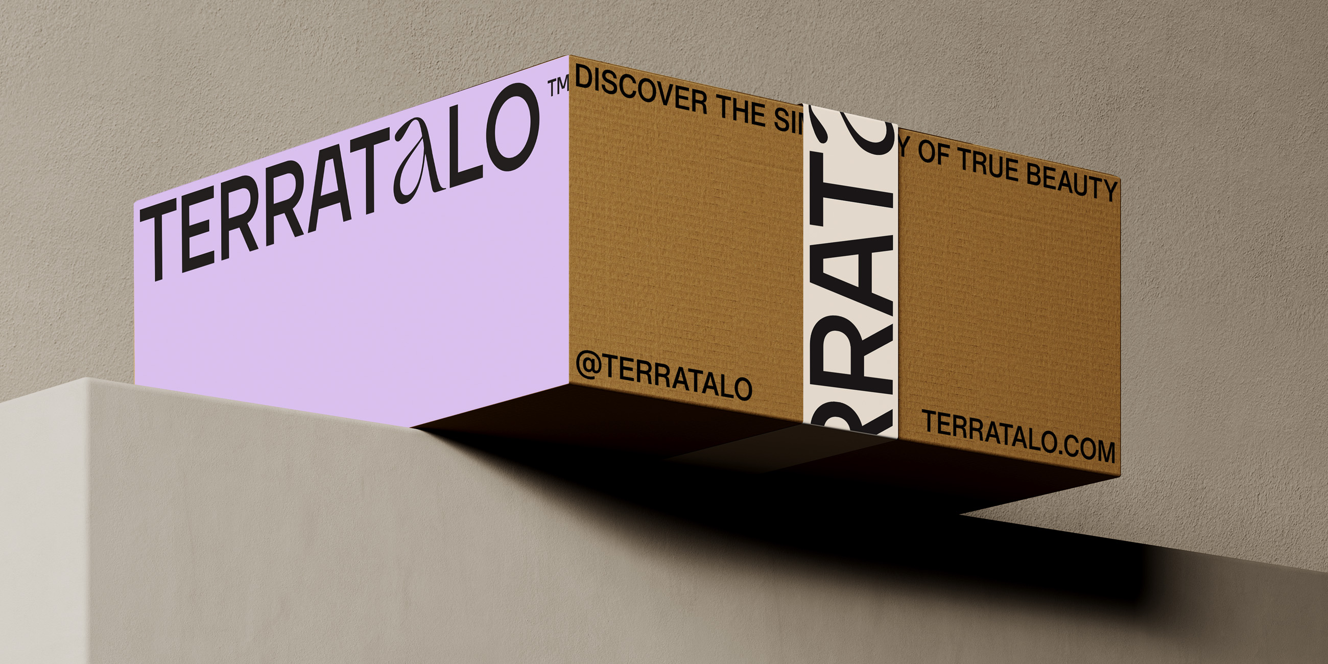
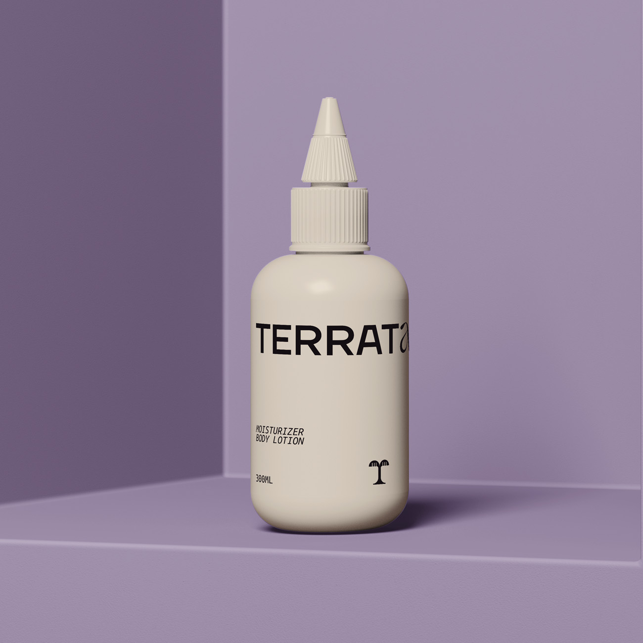
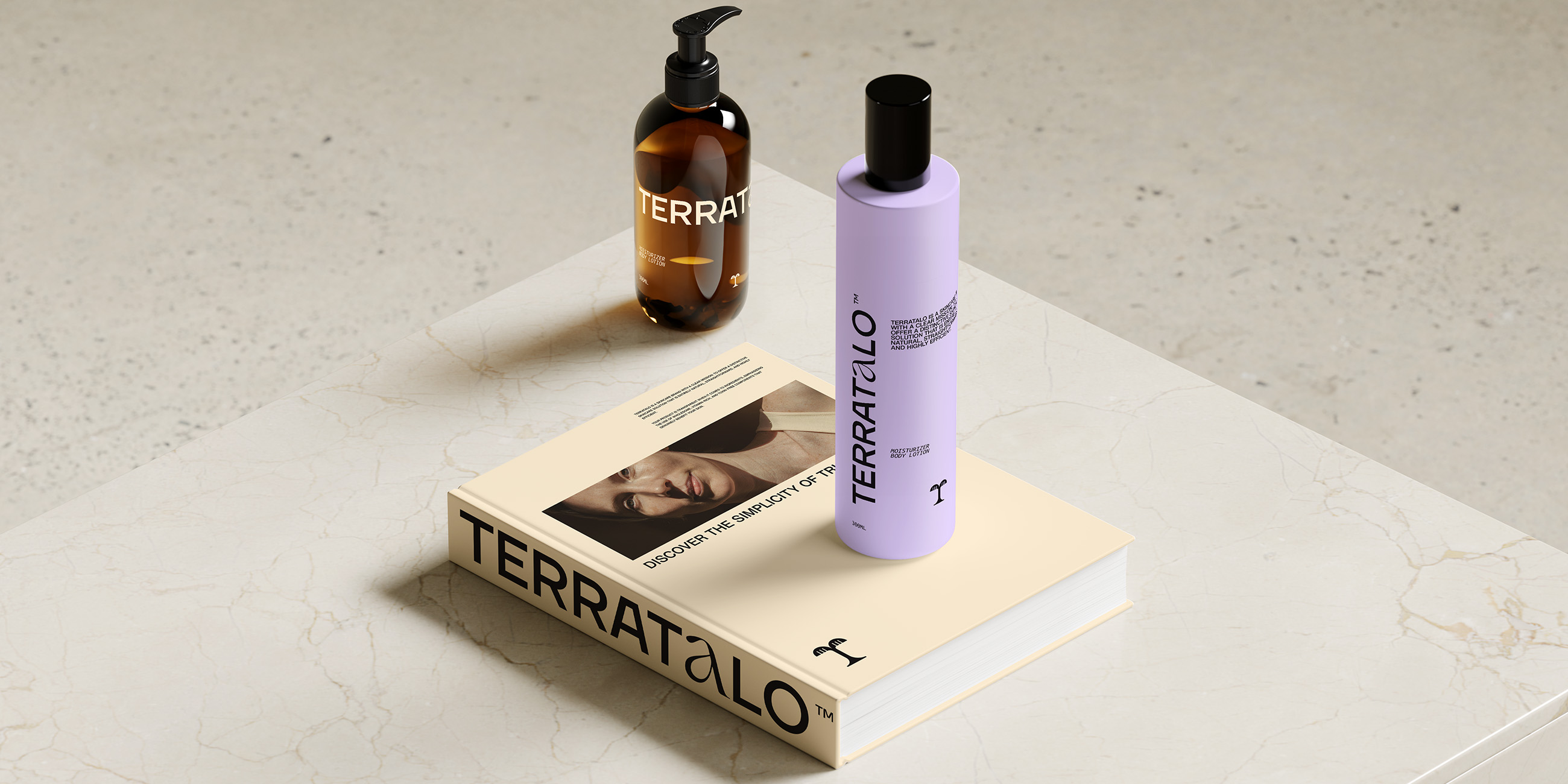
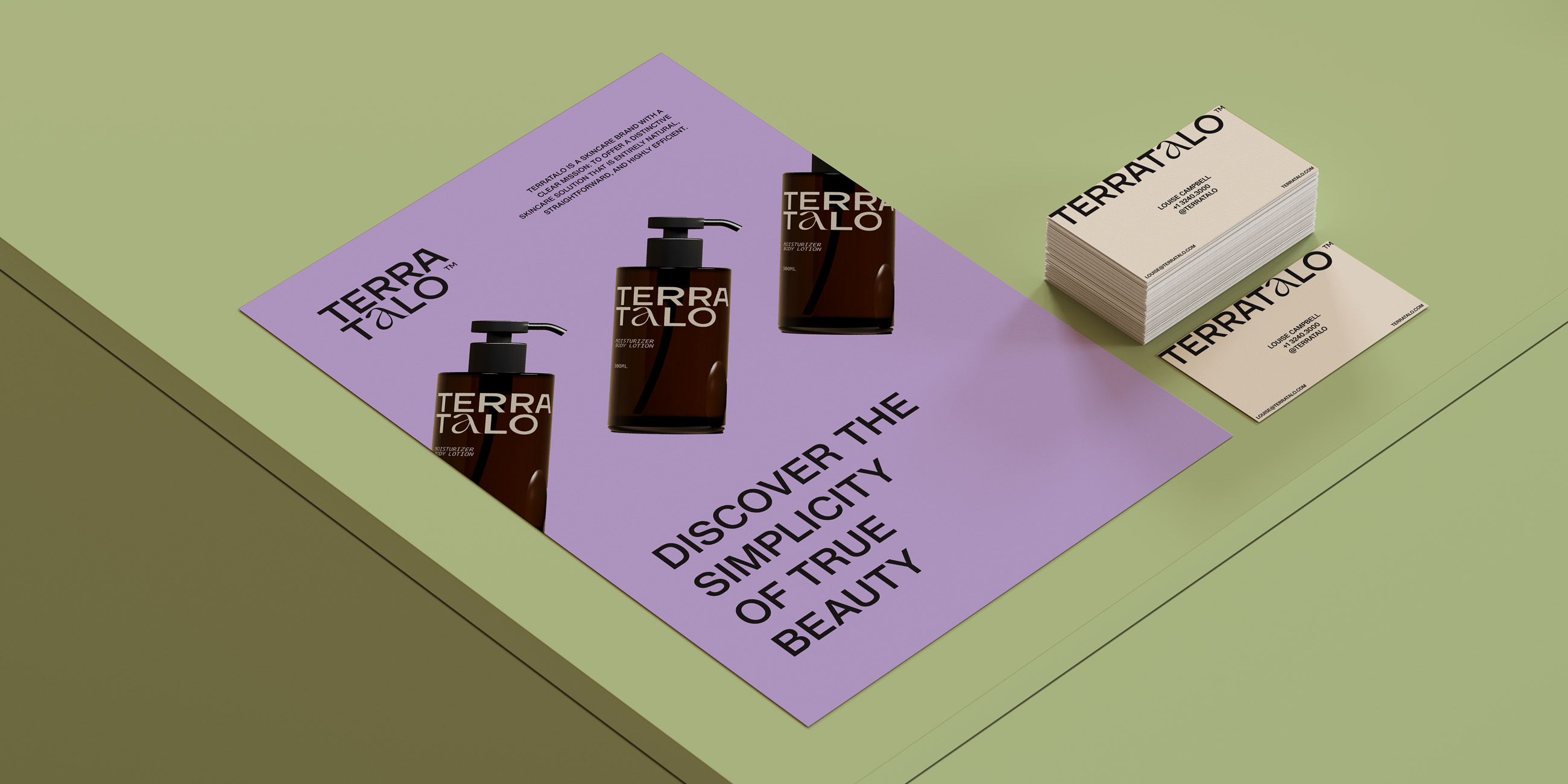
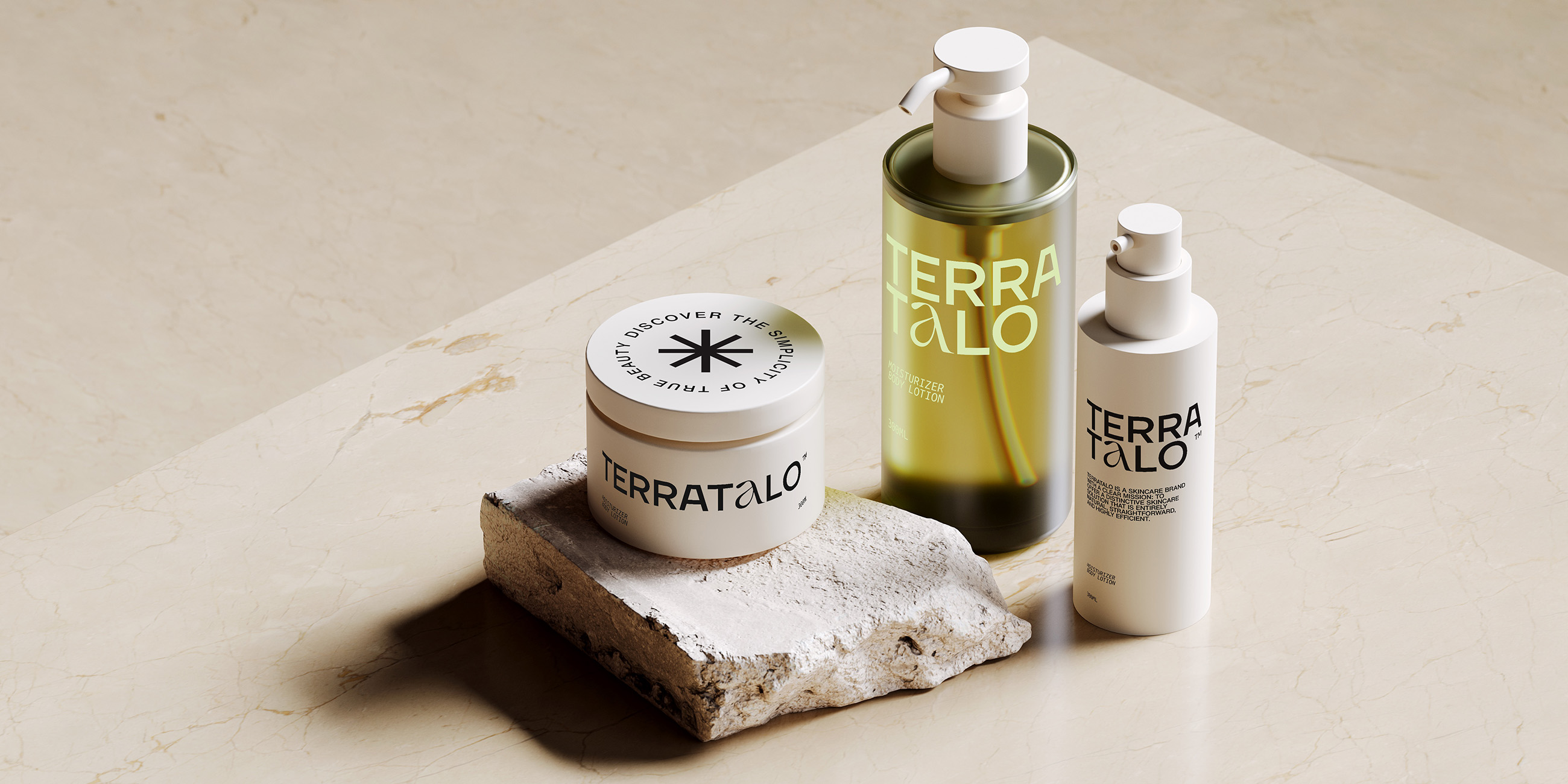
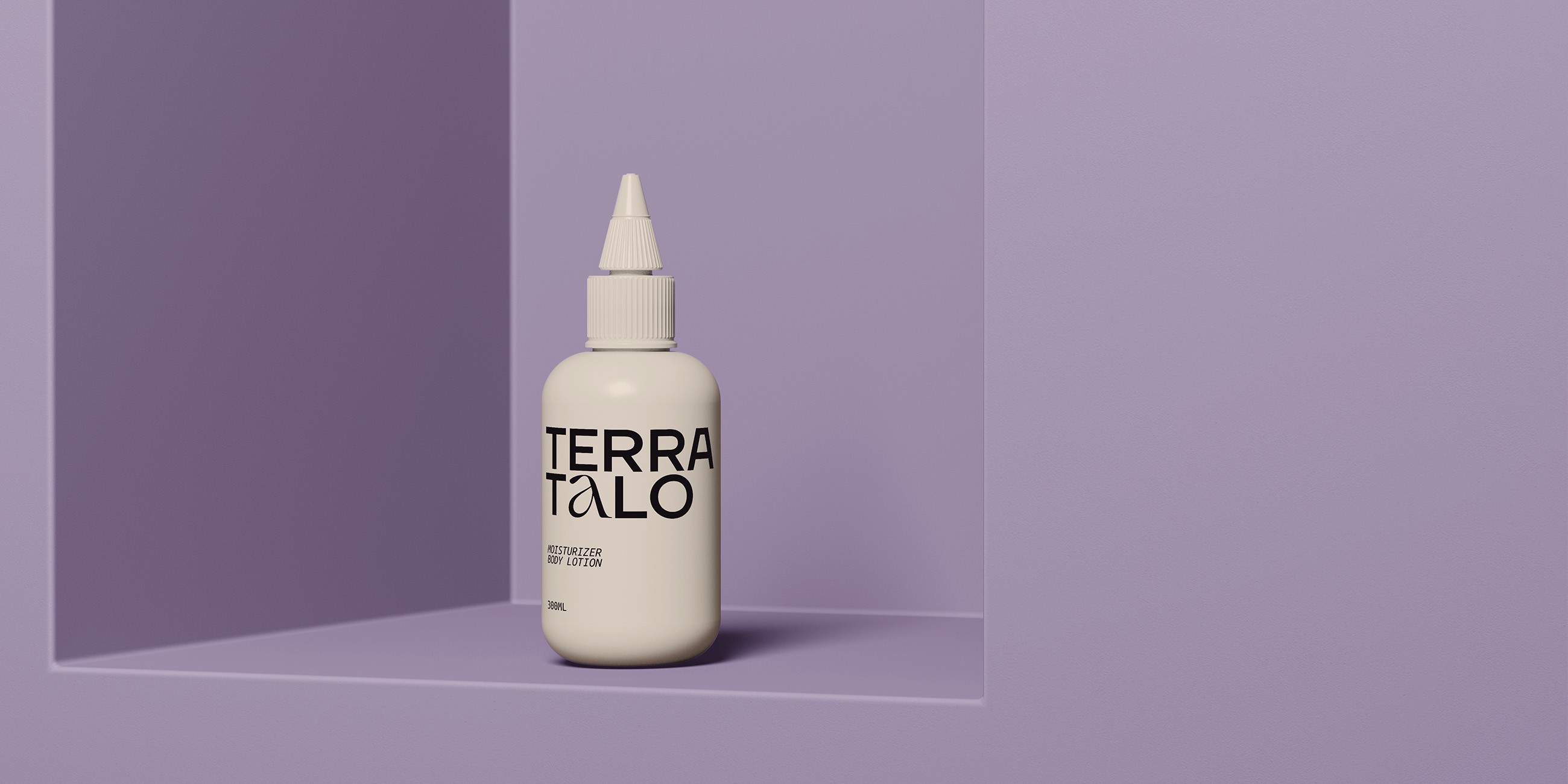
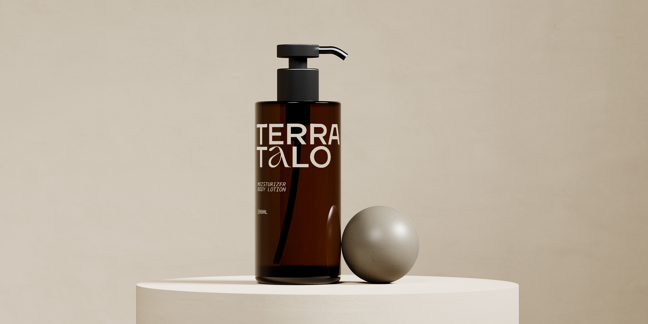
1.8 Packaging
1.9 Photography
Logo
The story and use of the Sponda logoSponda's sharp, bold and premium logo is the cornerstone of the identity. It encapsulates many of the key elements of the Sponda brand—high quality, durability and sustainability.
The logo may only be used in black or white.
Remember not to:
→ use logo in colour
→ scale or distort the logo
→ use effects (drop shadow etc.)
Logo Package
→ The TerraTalo's logo in all its formats can be downloaded here.


Symbol
The story and use of the Sponda logoSponda's sharp, bold and premium logo is the cornerstone of the identity. It encapsulates many of the key elements of the Sponda brand—high quality, durability and sustainability.

Reduction
The story and use of the Sponda logoSponda's sharp, bold and premium logo is the cornerstone of the identity. It encapsulates many of the key elements of the Sponda brand—high quality, durability and sustainability.

Digital
Min Width : 100px
Min Width: 2cm

Digital
Min Width : 100px
Min Width: 2cm
Clear Space
The story and use of the Sponda logoSponda's sharp, bold and premium logo is the cornerstone of the identity. It encapsulates many of the key elements of the Sponda brand—high quality, durability and sustainability.

Positive &
Negative
The story and use of the Sponda logoSponda's sharp, bold and premium logo is the cornerstone of the identity. It encapsulates many of the key elements of the Sponda brand—high quality, durability and sustainability.
Positivo

Negativo
Positivo

Negativo

Positivo

Negativo
Color Palette
Black & white spiced up with gemstones
All Sponda colours signal premium, high-level image. That image is especially emphasised through the darker, prestigious colours, while the lighter ones improve usability in practice.
The primary colours are Obsidian Black and Marble white, accompanied with two greys. Black is the primary choice for backgrounds on top of which the lighter elements play. That gives a premium look to any graphic application. White background works well in text-heavy applications, like presentations and reports. The two greys are also a solid option for backgrounds.
The secondary colours consist of two greens, Quartz and Emerald, and two blues, Turquoise and Sapphire. These are only used to spice up the design, never as much as the main colors.
Remember not to:
→ use secondary colours as primary colours
→ create own colours
→ change values / colour codes
Typography
The clear and simple typography is at the very core of the identity.
Visually the Sponda language is clear, simple and respects white space. It avoids cluttered layouts and multiple weights on one page. Contrasts, if needed, can be achieved through varying type size as shown in Best Practices.
Two fonts are used: The primary choice is a modern sans serif typeface called Aeonik, which generates a sharp, contemporary look & feel to any application. Aeonik is complemented by the secondary choice Saol, a very elegant and sophisticated serif typeface bringing a premium, high-end touch in the communication.
When Aeonik and Saol cannot be used, for instance in externally-shared MS Office applications, Aeonik can be replaced by Century Gothic and Saol with Times New Roman.
LIVE VIEW TERRATALO